I'm trying to use Magento2's .media-width() mixin. I followed the instructions from the devdocs and added the mixin in my theme like this:
.logo img {
  width: 125px;
  height: 29px;
  .media-width(@extremum, @break) when (@extremum = 'min') and (@break = @screen__m) {
    width: 250px;
    height: 58px;
  }
}
Only the CSS outside of the .media-width() is being generated. Nothing within it is being generated. Am I missing something.
UPDATE
Following the advice of @circlesix I did not nest the media query, but still I'm having some trouble.
.logo img {
  width: 125px;
  height: 29px;
}
.media-width(@extremum, @break) when (@extremum = 'min') and (@break = @screen__m) {
  .logo img {
    width: 177px;
    height: 41px;
  }
}
My desktop rule in the media query is being overruled by the first rule for .logo img as it is defined later in styles-l.css.
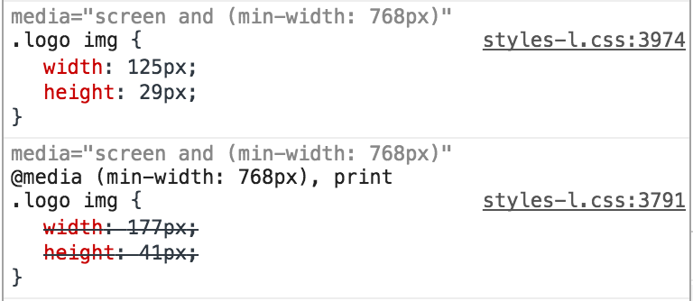
Interestingly I don't see the rule I defined within the media-width() mixin defined anywhere within styles-m.css. So perhaps I need to use the media-width() for both desktop & mobile views and only define common properties outside of it?
Best Answer
Ok, so I discovered a little more about this but as @circlesix pointed out it's not possible to use these LESS mixins nested like this.
Furthermore if you look at the
<head>section of Magento you'll notice that the styles-l.css is loaded after the mobile styles, i.e. styles-m.css.So styles-l.css is only loaded on screens 768px and over in width, saving mobile devices from having to load it.
If you write a LESS rule like normal without any of the mixins it will be put into both of these files and anything you add to with the
media-width()mixin will be added before it, and therefore overwritten.You can use the
@media-common = trueseparation variable to output it only to styles-m.css before any of the media query rules are added. This way it will be applied to both desktop and mobile devices, as both load styles-m.css.media-width()mixins under 768px are only put in styles-m.css, vice-a-versa anymedia-width()mixins 768px over in width is only put in styles-l.css.So, I think the best practice is to put all your common styles within
& when (@media-common = true) {}and use themedia-width()mixin for any css rules which are specific to a particular width.For instance, below is what I went with in the end...
It's the same approach used by Magento in: