I'm using the ultimo theme, and have some issues with header logo position.
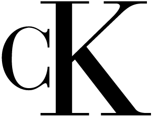
My logo is a square box, with some graphics 'sticking out' on the left. Let's say it looks like this:
http://goodlogo.com/images/logos/calvin_klein_logo_2623.gif
The K is the edge of the box, and the C is ‘sticking out’.
In the default layout, this alignment looks no so good – the logo is too far right. What I need is for the edge of the box (K), to be aligned with the left border of the page body/menu nav.
If I force the CSS like this:
.header .logo-wrapper { position: relative;
left: -15px; }
It kind of works, moving the logo a little to the left and the alignment looks as I’d hope.
But the responsiveness breaks. I need to somehow adjust the css when the small sizes kick in.
How can I do that? What is the best way to move the logo left?
(I know this might be theme specific – but not sure, so asking anyhow. I have a feeling this is more about responsive-theme handling in general)
update: here's a graphic to show what I mean: 
Best Answer
Your approach for large screens is correct, but I would suggest using negative margin instead of left positioning. Now, when the screen is smaller, your content container will ocupy all the width of the screen, so you cannot use a negative margin anymore because the logo will go outside the container, i.e. outside the screen.
In this case you will have to reset the left margin to 0 like this: