Magento 2.1 Grid – Changing Paging Options in Admin Grid

gridmagento-2.1paginationuicomponent

I've build a Magento 2 admin grid using ui-components.
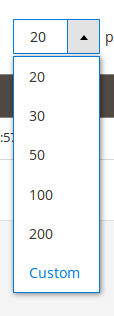
But I don't want the default paging of 20, 30, 50, ….
I want my own values.
For example 1,2 and 3.
I remember that in a beta version I could have done this inside my ui-component grid file

    <paging name="listing_paging">
        <argument name="data" xsi:type="array">
            <item name="config" xsi:type="array">
                <item name="options" xsi:type="array">
                    <item name="1" xsi:type="array">
                        <item name="value" xsi:type="number">1</item>
                        <item name="label" xsi:type="string" translate="true">1</item>
                    </item>
                    <item name="2" xsi:type="array">
                        <item name="value" xsi:type="number">2</item>
                        <item name="label" xsi:type="string" translate="true">2</item>
                    </item>
                    <item name="3" xsi:type="array">
                        <item name="value" xsi:type="number">3</item>
                        <item name="label" xsi:type="string" translate="true">3</item>
                    </item>
                </item>
            </item>
        </argument>
    </paging>

But that doesn't work anymore.
Is there a way to do that in 2.1?

And as a bonus question, How can I allow or restrict the custom value option?

paging

Best Answer

The Javascript that handles the amounts is in a different class: js/grid/paging/sizes.js. In that class, there is a list of options. There are two ways to do what you are going after. One approach is to extend the Javascript class and the second is to set the options with XML. The Javascript approach has some advantages, which are described below, but for what you described, the XML is the most succinct.

XML Approach:

You need to use the same keys that are in the defaults object of the sizes class. As a result, the name="xx" looks strange. Also, note the minSize and maxSize items. That will set the delimiters for the Custom value.

<item name="config" xsi:type="array">
    <item name="sizesConfig" xsi:type="array">
        <item name="value" xsi:type="string">15</item>
        <item name="minSize" xsi:type="string">4</item>
        <item name="maxSize" xsi:type="string">400</item>
        <item name="options" xsi:type="array">
            <item name="20" xsi:type="array">
                <item name="value" xsi:type="string">15</item>
                <item name="label" xsi:type="string">15</item>
            </item>
            <item name="30" xsi:type="array">
                <item name="value" xsi:type="string">35</item>
                <item name="label" xsi:type="string">35</item>
            </item>
            <item name="50" xsi:type="array">
                <item name="value" xsi:type="string">40</item>
                <item name="label" xsi:type="string">40</item>
            </item>
            <item name="100" xsi:type="array">
                <item name="value" xsi:type="string">90</item>
                <item name="label" xsi:type="string">90</item>
            </item>
        </item>
    </item>
</item>

Javascript Approach:

XML:

The item name="config" only needs to have the new component location:

<item name="config" xsi:type="array">
    <item name="sizesConfig" xsi:type="array">
        <item name="component" xsi:type="string">Your_Component/js/grid/paging/sizes</item>
    </item>
</item>

JS:

// Your/Module/view/base/web/js/grid/paging/sizes.js

define([
    'Magento_Ui/js/grid/paging/sizes'
], function (Sizes) {
    'use strict';

    return Sizes.extend({
        defaults: {
            value: 2,
            options: {
                '2': {
                    value: 2,
                    label: 2
                },
                '3': {
                    value: 3,
                    label: 3
                },
                '5': {
                    value: 5,
                    label: 5
                }
            },
            excludedOptions: ['20', '30', '50', '100', '200'],
            statefull: {
                options: false // NOT necessary; debugging only
            }
        },
        /**
         * @override
         */
        initialize: function () {
            this._super();

            this.excludedOptions.forEach(function (exclusion) {
                delete this.options[exclusion];
            }, this);

            this.updateArray();

            return this;
        }
    });
});

There are a few things to note on the Javascript above. Because the defaults are merged (or technically "extended"), the core Sizes.js option's come along for the ride. Without deleting the core options, they would display in the list. This can be circumvented, however, if you declare 5 or more options and use the same keys as the core (example below). Obviously, doing that isn't as ideal when reading the code as it doesn't make a huge amount of sense.

Minimal defaults:

With this, no initialize() override is needed.

defaults: {
    value: 2,
    options: {
        '20': {
            value: 2,
            label: 2
        },
        '30': {
            value: 3,
            label: 3
        },
        '50': {
            value: 5,
            label: 5
        },
        '100': {
            value: 10,
            label: 10
        },
        '200': {
            value: 20,
            label: 20
        }
    }
},

Limiting Custom:

You have a few options here if you are extending the Javascript class. The easiest is to set minSize and maxSize to more limited values. Alternatively, you can override the applyCustom() method or normalize() (the latter is preferred) to add custom rules if needed.


A note regarding state:

Beware of the statefull (sic) object. It adds that property to the list of what gets saved into the database. As you are working on this, check the ui_bookmark, and clean the cms_page_listing for your user ID if necessary.

Related Topic