As part of creating a custom theme, and partially following the guide on the Magento site, I added a LESS file at:
<theme-dir>/Vendor/theme/Magento_Customer/web/css/source/_extend.less
When I view the CSS in Firebug, it looks like all of my styles from this new file are being used twice on the same element, as if its including _extend.less twice.

About my setup:
- Magento is in Development mode
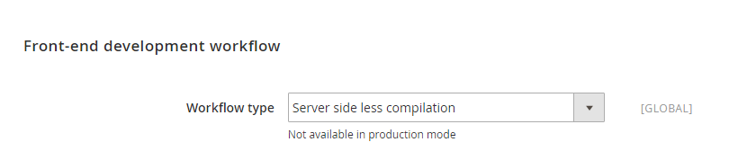
- LESS compilation is set to client-side
- I confirmed I am still seeing this with server-side compilation
- Cache is disabled
Why is this happening?
Best Answer
Looking into this a bit more I think it's down to
styles-l.lessandstyles-m.lessas they both import the same code unless specified with the @media-common variable.You can read more on this by going to
file:///**PATH-TO-LOCAL-MAGENTO-2-INSTALL/lib/web/css/docs/responsive.html- I need to access this on my OS and not within the virtual box. I also need to open it in Firefox as it's buggy in Chrome.The relevant section is:
Media query style groups separation variables
@media-common: true|false - sets whether to output common styles. For common styles every time you want to add some styles you should use
@media-target: all|desktop|mobile - Sets target device for styles output
Gathering
Everything that you include in collector mixins above will go in place where they declarated. As example all
Will go to
Example
I've taken this example from
var/view_preprocessed/css/frontend/PartyShowroom/default/en_GB/Magento_Catalog/css/source/_widgets.lessDesktop and mobile
Mobile
Desktop
TL:DR
You can use the @media-target variable to set whether to output that code block to styles-l.css, styles-m.css or both.
More info can be found in:
var/view_preprocessed/css/frontend/**STORE-NAME**/**THEME-NAME**/en_GB/css/source/lib/_responsive.lessfile:///**PATH-TO-LOCAL-MAGENTO-2-INSTALL/lib/web/css/docs/responsive.html