Magento – Magento 2 – 3rd level menu items collapsed on mobile devices magento-2.1.2magento2mobiletopmenu a quick question: The appearance of the menu on mobile devices in magento 2 is : 
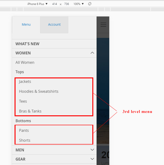
with the 3rd level menu expanded by default. 
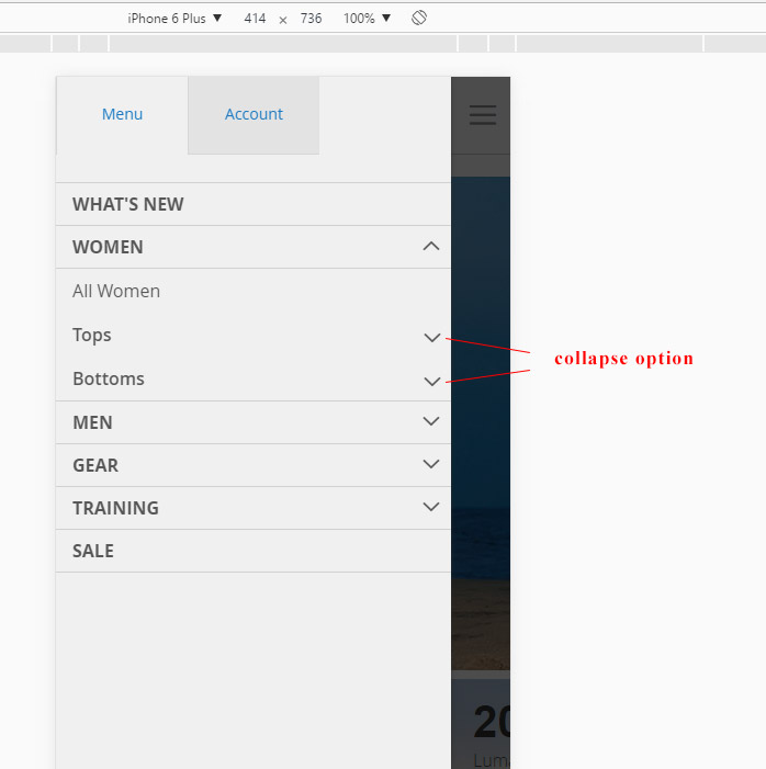
Is there a way to make the 3rd level menu collapsed by default? something like this: Best Answer Okay, I came up with a solution. It may not be ideal, but it works for me. Hopefully somebody will find it useful. It will depend on the base theme you're using, but first of all I had to comment out this line in styles-m.css: .navigation .submenu:not(:first-child).expanded { // display: block !important; ... } In my own mobile stylesheet, that's set to the same breakpoint as where the responsive menu kicks in, I have this: li.level0 ul { display:none; } li.level0 ul a { position:relative; } .rm-expand { float:right;display:block;font-family: 'icons-blank-theme';font-size:42px;position:absolute;right: 7px;top: -6px; } Then finally, in my Javascript file I have: require(['jquery', 'jquery/ui'], function($){ // ... Irrelevant code omitted ... $(document).ready(function() { // ... Irrelevant code omitted ... $('li.level0 li.parent > a').append('<span class="rm-expand"></span>'); $('.rm-expand').click(function() { if ($(this).hasClass('open')) { $(this).parent().parent().find('ul:first').slideUp(); $(this).removeClass('open'); $(this).html(''); } else { $(this).parent().parent().find('ul:first').slideDown(); $(this).addClass('open'); $(this).html(''); } return false; }); // ... Irrelevant code omitted ... }); Related SolutionsMagento2 – Mobile Menu Setup Guide You can use following code in your CSS for displaying menu in your mobile device @media only screen and (max-width: 767px) { body.cms-my-homepage div.main-menu.menu-style-2{display:block} } Magento 2 – Click on 2nd Level Submenu Closes All Menus in Mobile View 1) Create mixin for mage/menu 2) rewrite function _toggleMobileMode 3) add 3 lines to the 'click .ui-menu-item:has(a)' method this.active = null; this.select(event); this.expand(event) 4) It works full code of mixin: define([ 'jquery', 'jquery/ui' ], function($) { "use strict"; return function (widget) { $.widget('mage.menu', widget.menu, { _toggleMobileMode: function () { var subMenus; $(this.element).off('mouseenter mouseleave'); this._on({ /** * @param {jQuery.Event} event */ 'click .ui-menu-item:has(a)': function (event) { var target; event.preventDefault(); target = $(event.target).closest('.ui-menu-item'); target.get(0).scrollIntoView(); if (!target.hasClass('level-top') || !target.has('.ui-menu').length) { window.location.href = target.find('> a').attr('href'); } this.active = null; this.select(event); this.expand(event) }, /** * @param {jQuery.Event} event */ 'click .ui-menu-item:has(.ui-state-active)': function (event) { this.collapseAll(event, false); } }); subMenus = this.element.find('.level-top'); $.each(subMenus, $.proxy(function (index, item) { var category = $(item).find('> a span').not('.ui-menu-icon').text(), categoryUrl = $(item).find('> a').attr('href'), menu = $(item).find('> .ui-menu'); this.categoryLink = $('<a>') .attr('href', categoryUrl) .text($.mage.__('All %1').replace('%1', category)); this.categoryParent = $('<li>') .addClass('ui-menu-item all-category') .html(this.categoryLink); if (menu.find('.all-category').length === 0) { menu.prepend(this.categoryParent); } }, this)); }, }); return $.mage.menu; } }); Related Topic
Best Answer
Okay, I came up with a solution. It may not be ideal, but it works for me. Hopefully somebody will find it useful.
It will depend on the base theme you're using, but first of all I had to comment out this line in styles-m.css:
In my own mobile stylesheet, that's set to the same breakpoint as where the responsive menu kicks in, I have this:
Then finally, in my Javascript file I have: