On the Magento/Blank theme and themes inheriting from Magento/Blank the mobile menu is expanding too far off the screen when active.
The nav element
.nav section has a width that is calculated as such:
width: calc(100% - 54px)
However the calculated width is near double the width of the html itself. This behavior is also only seen when viewed via responsive emulation (Chrome device mode for example) or on a mobile device. Simply reducing the size of the window will give a proper width.
Has anyone else ran into this same issue? Using the Magento/Luma theme does not have this issue. I cannot provide a url for the site as it is local to my machine and I was unable to find an M2 demo on the internet that is not using Magento/Luma.
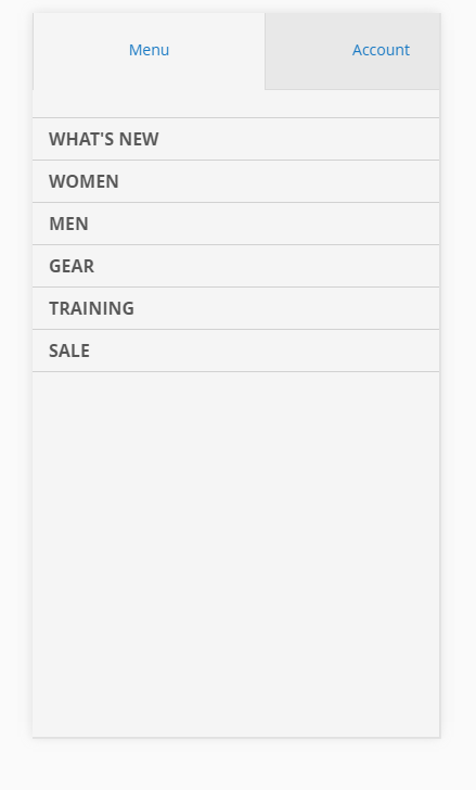
Menu in device Mode:
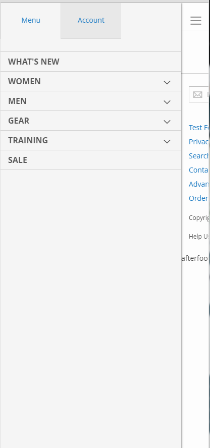
Menu with reduced window size
Best Answer
I also came across this issue.
I opted to overwrite the
_navigation.lessfile in the./web/css/source/directory of my theme. Do this by copying and paste the corresponding file from the Blank theme.Search for the following selector:
Within the "left" & "width" properties, I replaced the value 100% with 100vw. You'd think they'd be the same value since 100% should be 100% of the viewport, but it seemed to address the issue. Not sure why.
The resulting selector should like like this, note the replaced 100% values:
Let me know if this works for you. Maybe someone can explain the behavioral difference between 100% and 100vw here. To me it shouldn't make a difference.