First you will have to Create ’custom_form.xml’ in folder ‘Vendor/Module/view/adminhtml/ui_component’.
Within the form define your main field as mentioned below
 <field name="main_field">
        <argument name="data" xsi:type="array">
            <item name="config" xsi:type="array">
                <item name="label" xsi:type="string" translate="true">Type</item>
                    <item name="visible" xsi:type="boolean">true</item>
                    <item name="dataType" xsi:type="string">number</item>
                    <item name="formElement" xsi:type="string">select</item>
                    <item name="source" xsi:type="string">main_field</item>
                    <item name="dataScope" xsi:type="string">main_field</item>
                    <item name="validation" xsi:type="array">
                        <item name="required-entry" xsi:type="boolean">true</item>
                    </item>
                    <item name="options" xsi:type="array">
                            <item name="0" xsi:type="array">
                                <item name="label" xsi:type="string">Dependent Field 1</item>
                                <item name="value" xsi:type="string">0</item>
                            </item>
                            <item name="2" xsi:type="array">
                                <item name="label" xsi:type="string">Dependent Field 1</item>
                                <item name="value" xsi:type="string">2</item>
                            </item>
                    </item>
                </item>
            </argument>
    </field>
I have defined a select type drop down field with two options labelled “Dependent Field 1” and “Dependent Field 1”. Now to show and hide the fields according to the selected option type all you need to add is the just after the settings tag. We need to add rules to the switcher config which defines which component will be displayed on selection from the main field.
  <settings>
    <switcherConfig>
        <rules>
            <rule name="0">
                <value>0</value>
                <actions>
                    <action name="0">
                        <target>custom_form.custom_form.custom_form_details.dependent1</target>
                        <callback>show</callback>
                    </action>
                    <action name="1">
                        <target>custom_form.custom_form.custom_form_details.dependent2</target>
                        <callback>hide</callback>
                    </action>
                </actions>
            </rule>
            <rule name="1">
                <value>1</value>
                <actions>
                    <action name="0">
                        <target>custom_form.custom_form.custom_form_details.dependent1</target>
                        <callback>hide</callback>
                    </action>
                    <action name="1">
                        <target>custom_form.custom_form.custom_form_details.dependent2</target>
                        <callback>show</callback>
                    </action>
                </actions>
            </rule>
        </rules>
<enabled>true</enabled>
– define the registry key where the dependent field component is saved in the registry. Here custom_form is the name of the form and custom_form_details is the field set name.
– a callable method available in the component. If you use a custom component, you can call that method.
After adding the switcher you need to define your dependent fields
<field name="dependent1">
<argument name="data" xsi:type="array">
    <item name="config" xsi:type="array">
        <item name="sortOrder" xsi:type="number">6</item>
        <item name="dataType" xsi:type="string">text</item>
        <item name="label" xsi:type="string" translate="true">Dependent Field 1</item>
        <item name="formElement" xsi:type="string">input</item>
        <item name="source" xsi:type="string">dependent1</item>
        <item name="dataScope" xsi:type="string">dependent1</item>
            <item name="validation" xsi:type="array">
            <item name="required-entry" xsi:type="boolean">true</item>
        </item>
    </item>
</argument>
6
text
Dependent Field 2
input
dependent2
dependent2
true
once defined the output will look like this!
Hope this will help you guys!!
Happy Coding!!
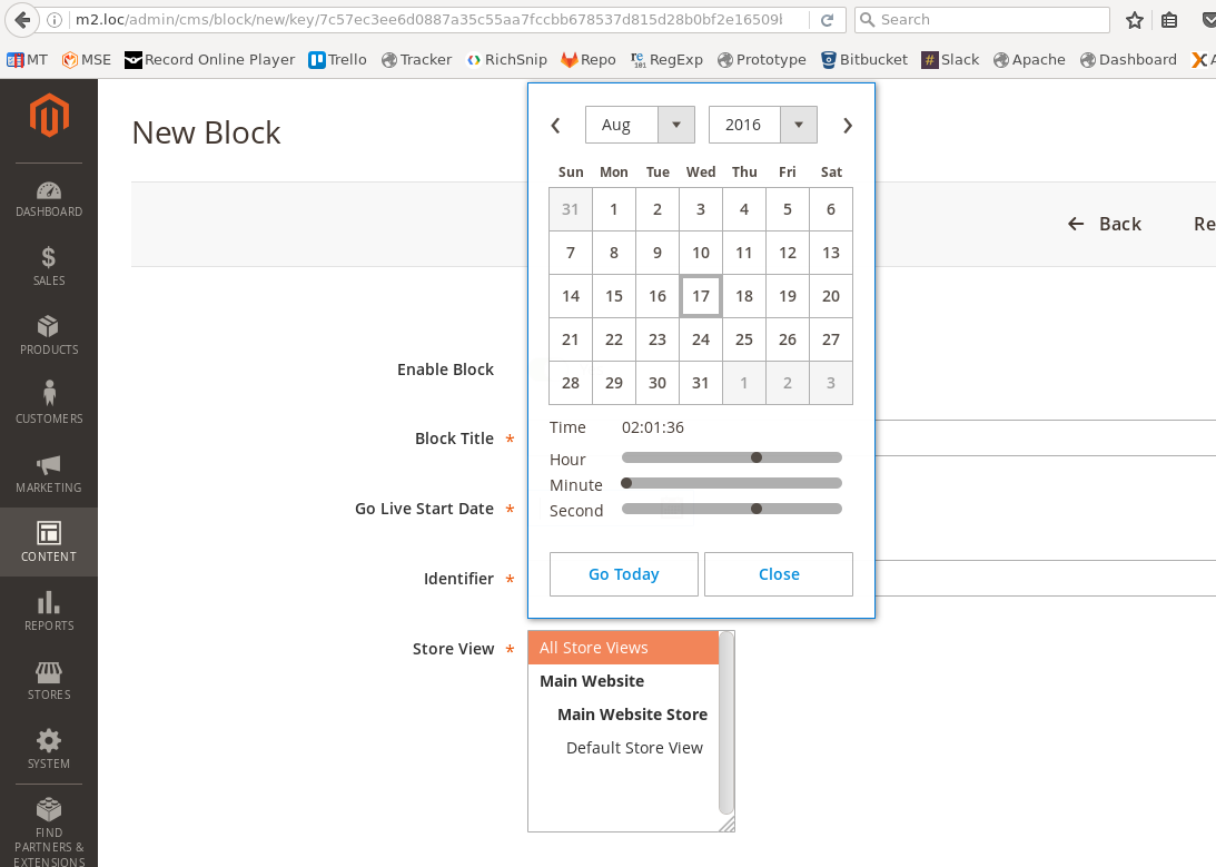
To add the dateTime picker you should use the next directive inside the xml file:
<field name="start_date">
    <argument name="data" xsi:type="array">
        <item name="config" xsi:type="array">
            <item name="dataType" xsi:type="string">string</item>
            <item name="label" xsi:type="string" translate="true">Go Live Start Date</item>
            <item name="formElement" xsi:type="string">date</item>
            <item name="source" xsi:type="string">page</item>
            <item name="sortOrder" xsi:type="number">21</item>
            <item name="dataScope" xsi:type="string">start_date</item>
            <item name="validation" xsi:type="array">
                <item name="required-entry" xsi:type="boolean">true</item>
            </item>
            <item name="options" xsi:type="array">
                <item name="dateFormat" xsi:type="string">yyyy-MM-dd</item>
                <item name="timeFormat" xsi:type="string">HH:mm:ss</item>
                <item name="showsTime" xsi:type="boolean">true</item>
            </item>
            <item name="storeTimeZone" xsi:type="string">string</item>
        </item>
    </argument>
</field>
Important thing is the showsTime option.
Result should look like this:
If you want to debug the UI element - use this command inside the browser console (on your page):
require('uiRegistry').get('index = start_date')
It returns your date element with all initial options and all possible functions:
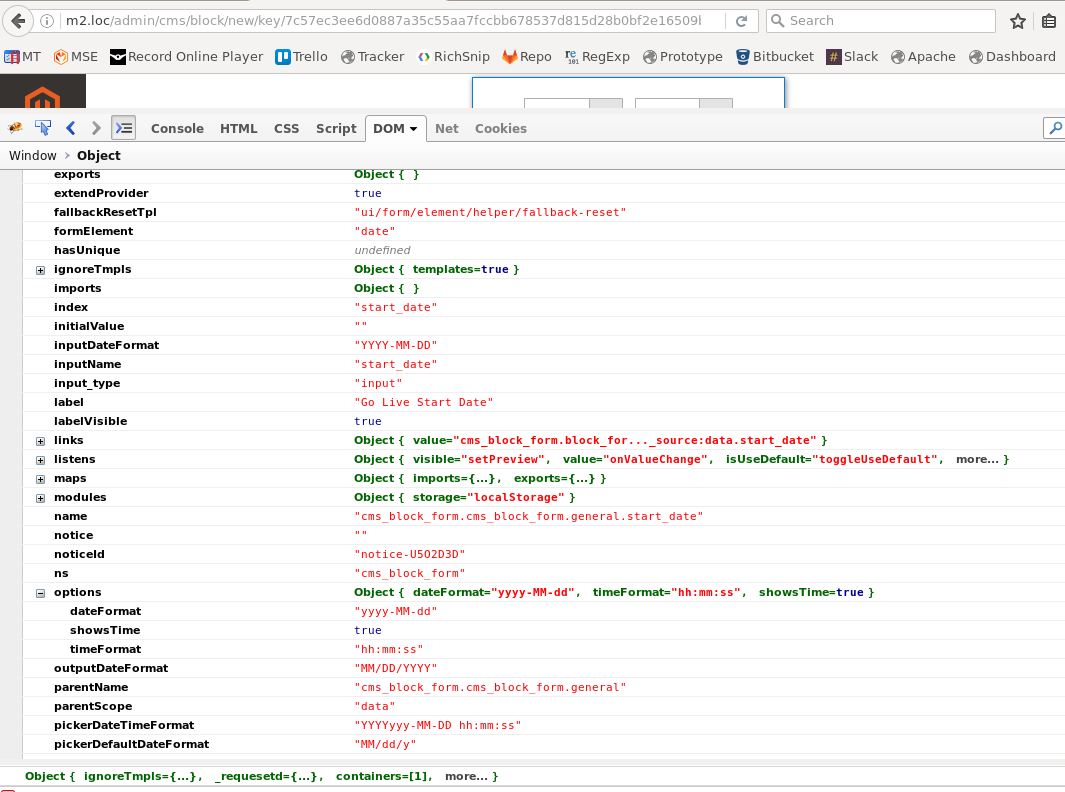
You can use them when you define the element (inside xml).
As additional info:
The date (also dateTime) element could be found here:
app/code/Magento/Ui/view/base/web/js/form/element/date.js
in the static files:
pub/static/adminhtml/Magento/backend/en_US/Magento_Ui/js/form/element/date.js
The date-element class (object) has method prepareDateTimeFormats, where the important option showsTime is checked:
/**
 * Prepares and converts all date/time formats to be compatible
 * with moment.js library.
 */
prepareDateTimeFormats: function () {
    this.pickerDateTimeFormat = this.options.dateFormat;

    if (this.options.showsTime) {
        this.pickerDateTimeFormat += ' ' + this.options.timeFormat;
    }

    this.pickerDateTimeFormat = utils.normalizeDate(this.pickerDateTimeFormat);

    if (this.dateFormat) {
        this.inputDateFormat = this.dateFormat;
    }

    this.inputDateFormat = utils.normalizeDate(this.inputDateFormat);
    this.outputDateFormat = utils.normalizeDate(this.outputDateFormat);

    this.validationParams.dateFormat = this.outputDateFormat;
}
Best Answer
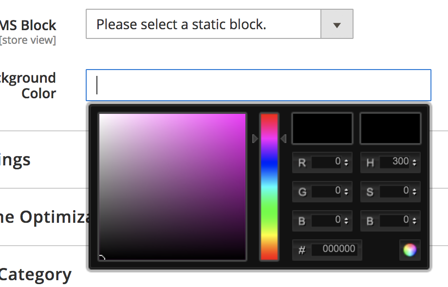
I recently needed to add a color picker to a category form. Here is what wound up working:
It's essentially a generic text input, but we've defined a unique
elementTmplandcomponent.I'm initiating the color picker with an
afterRendercallback. In my use case the element was not rendered on the page when my component was initialized, so adding the color picker in theinitialmethod did not work for me.You'll also want to add the color picker css as a layout update, so the filename will vary:
End Result (Input Focus State)