There are two different versions which we have used. The first is the same one which @Marius made mention of minus the specific "Fennec" mention (which is no longer in the UA string of FF Mobile). I got it from similar sources:
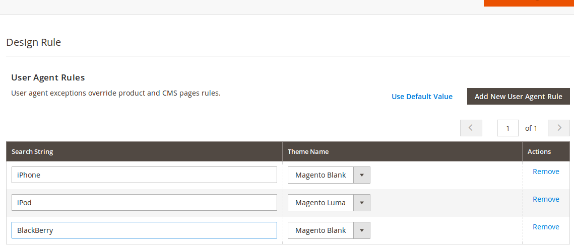
iPhone|iPod|BlackBerry|Palm|Googlebot-Mobile|Mobile|mobile|mobi|Windows Mobile|Safari Mobile|Android|Opera Mini
The second is the same, but with the term "Mobile" removed so that the mobile version of a site is not served to the iPad, which includes Mobile in it's user agent. Apple even makes a point to call this out in TN2262:
Safari on iPad is capable of delivering a "desktop" web experience,
and users will expect this experience since iPad has a large screen
and fast network connectivity. If you have a version of your website
that is optimized for mobile devices with small screens, do NOT serve
this mobile version to iPad users.
...
Note that the Safari on iPad user agent string contains the word
"Mobile", but does not contain the word "iPhone". If you are currently
serving mobile content to any browser that self-identifies as
"Mobile", you should modify your user agent string checks to look for
iPad and avoid sending it the wrong version of your site.
Based on what I see on the FF Mobile, using "Android" in this string will cause trouble if you want the desktop theme served to all tablets (and not just iPads) since it's been decided to include it in the UA string for various reasons.
I've honestly not personally tested the coverage of the above strings. I do know this: It's a complicated mess! :)
Note: If you are setting this up on EE 1.12 or earlier (haven't checked 1.13) you will need a patch from Magento Support for the FPC to work properly. It fails to take design exceptions into account in the release build.
Update 1:
The noted bug requiring a patch for design exceptions to work still exists in EE 1.13.0.0 and 1.13.1.0. There is a patch available from Magento support and it's on their known issues list: SUPEE-1598
Yes, what you looking for is a theme with "responsive design", which means the theme will change depending on the size of the screen.
If you google responsive design you will get some examples of it. There are alot of themes you get for magento that are responsive, but converting an existing custom theme to a responsive layout can be expensive
Updated due to original question being changed
If you do have a responsive design then you could use something like this:
http://filzhut.net/projects/responsive-switch/
Best Answer
Try to create multiple exceptions for each device