I copied this sidenav demo from the angular material docs.
https://material.angularjs.org/latest/demo/sidenav
And added the first toolbar demo to it from https://material.angularjs.org/latest/demo/toolbar
What I want is the toolbar to be fixed.
Codepen demo: http://codepen.io/gvorster/pen/BzWvGe
When adding this style the toolbar is fixed.
<md-toolbar class="md-hue-2" style="position:fixed !important">
But the icons on the right are gone.

Resizing the screen until the sidenav is hidden will show the right side icons.
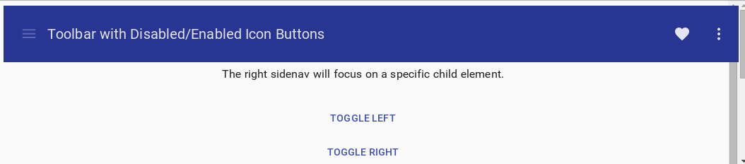
Removing the style shows the right side icons but the toolbar is not fixed:

Is there a way to get a sticky toolbar and have the rigth side icons shown.
Best Answer
You have to use
md-sidenavinside themd-contentcontainer. Plus try to usemd-contentinstead ofdivtag. In your example you gave wrong values tolayout-alignattribute. Please check the appropriate values in the Docs.Here is the basic structure for your requirement.
here is the working pen. http://codepen.io/next1/pen/xOqMjy