Is it possible to control the length and distance between dashed border strokes in CSS?
This example below displays differently between browsers:
div {
border: dashed 4px #000;
padding: 20px;
display: inline-block;
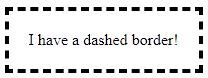
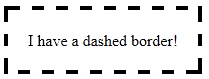
}<div>I have a dashed border!</div>Big differences: IE 11 / Firefox / Chrome
Are there any methods that can provide greater control of the dashed borders appearance?
Best Answer
The native dashed border property value does not offer control over the dashes themselves... so bring on the
border-imageproperty!Brew your own border with
border-imageCompatibility: It offers great browser support (IE 11 and all modern browsers). A normal border can be set as a fallback for older browsers.
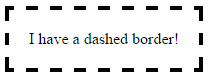
Let's create these
These borders will display exactly the same cross-browser!
Step 1 - Create a suitable image
This example is 15 pixels wide by 15 pixels high and the gaps are currently 5px wide. It is a .png with transparency.
This is what it looks like in photoshop when zoomed in:
This is what it looks like to scale:
Controlling gap and stroke length
To create wider / shorter gaps or strokes, widen / shorten the gaps or strokes in the image.
Here is an image with wider 10px gaps:
Step 2 - Create the CSS — this example requires 4 basic steps
Define the border-image-source:
Optional - Define the border-image-width:
The default value is 1. It can also be set with a pixel value, percentage value, or as another multiple (1x, 2x, 3x etc). This overrides any
border-widthset.Define the border-image-slice:
In this example, the thickness of the images top, right, bottom and left borders is 2px, and there is no gap outside of them, so our slice value is 2:
The slices look like this, 2 pixels from the top, right, bottom and left:
Define the border-image-repeat:
In this example, we want the pattern to repeat itself evenly around our div. So we choose:
Writing shorthand
The properties above can be set individually, or in shorthand using border-image:
Complete example
Note the
border: dashed 4px #000fallback. Non-supporting browsers will receive this border.