Question: How can I get a border to stretch to the height of the parent and surround child cell. Given I am using flexbox and aligning to baseline.
Can this be done with all css?
More Details:
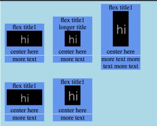
I am using flex box to align my items in each row to a certain baseline. It is centered on each cell under "center here" in the following picture:
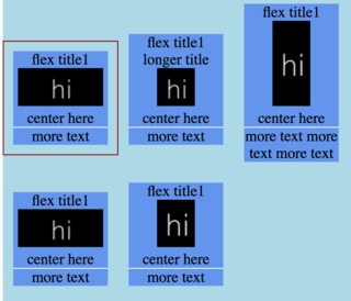
When I hover currently on each item it hovers with a solid line with a 10px margin around each cell:
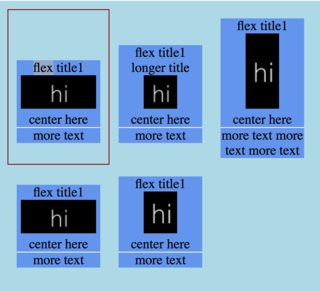
I want the on hover border to stretch to the top and bottom of the row on hover like this:
That way when I hover on each item, their hover border boxes would line up like this:
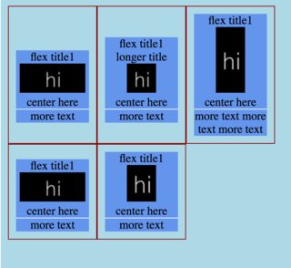
^ this is what I would like it to look like if I turn hover on, on each cell.
/* on hover i want this to be a box around the item, and to have the top and the bottom of the border be touching the top/bottom of the row it is on */
.flex-item:hover {
  border: 1px solid darkred;
}

/* so item doesn't move when not hovering */
.flex-item {
  border: 1px solid lightblue;
}

.flex-container {
  overflow: hidden;    position: relative;
  display: -webkit-flex;
  display: flex;
  -webkit-align-items: baseline;
  align-items: baseline;
  width: 400px;
  height: 350px;
  background-color: lightblue;
  flex-wrap: wrap;
  padding: 10px;
}

.inner-wrapper {
  display: inline-block;
  text-align: center;
  width: 100px;
  margin: 10px;
  background-color: cornflowerblue;
}

.flex-body {
  border-bottom: 1px solid #fff;
}
.flex-body-more {
  float: left;
  clear: left;
  width: 100%;
}
.flex-img {
  justify-content: center;
  align-items: center;
}
<div class="flex-container">
<div class="flex-item">
<div class="inner-wrapper">
<div class="flex-title">flex title1</div>
<div class="flex-img">
<img src='http://dummyimage.com/90x40/000/ffffff&text=hi'>
</div>
<div class="flex-body">center here</div>
<div class="flex-body-more">more text</div>
</div>
</div>
<div class="flex-item">
<div class="inner-wrapper">
<div class="flex-title">flex title1 longer title</div>
<div class="flex-img">
<img src='http://dummyimage.com/40x40/000/ffffff&text=hi'>
</div>
<div class="flex-body">center here</div>
<div class="flex-body-more">more text</div>
</div>
</div>
<div class="flex-item">
<div class="inner-wrapper">
<div class="flex-title">flex title1</div>
<div class="flex-img">
<img src='http://dummyimage.com/40x90/000/ffffff&text=hi'>
</div>
<div class="flex-body">center here</div>
<div class="flex-body-more">more text more text more text</div>
</div>
</div>
<div class="flex-item">
<div class="inner-wrapper">
<div class="flex-title">flex title1</div>
<div class="flex-img">
<img src='http://dummyimage.com/90x40/000/ffffff&text=hi'>
</div>
<div class="flex-body">center here</div>
<div class="flex-body-more">more text</div>
</div>
</div>
<div class="flex-item">
<div class="inner-wrapper">
<div class="flex-title">flex title1</div>
<div class="flex-img">
<img src='http://dummyimage.com/40x50/000/ffffff&text=hi'>
</div>
<div class="flex-body">center here</div>
<div class="flex-body-more">more text</div>
</div>
</div>
</div>
Best Answer
Just a few rules that you'll need to adjust to your flex items:
See code snippet below: