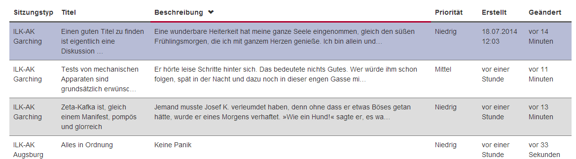
I have a webpage that lists items. The default template uses a table for that, which i find very appropriate. In this table however, there is one column that contains much more text than the others:
While that works out on a large screen, it is very annoying to read on a small screen:

In order to use the available space better, I can only think of a fake-table layout using divs. I did a prototype, using bootstrap grid layout, that looks like a table row on large screens, but has a different layout on small and extra small screens:

While that improves the readability of the text by using the full width, I cannot use the utilities I've got for tables any more, and it breaks the user experience in subtle ways. For example, I use a nice script that enables sorting at the client. But that works only on real tables. (Also, there are small inconsistencies and visual differences between real tables and fake tables)
Is there any way that I can reformat a table row into a multi-line container similar to the one in the last image?
FYI: I am using jquery 2.1.1, Bootstrap 3.2.0.1 as GUI Framework and asp.net MVC on the server.
Bootply is here: http://www.bootply.com/pRehwTai4G
Edit: in case that did not come out clear enough: I want to keep the <tr> and <td> tags but style them similar to the divs. I do not want to replace the table with divs.
Best Answer
You can do this purely with a couple of lines of css...
.calculator is the class used for the table:
I use this to quickly alter the table that I use for calculator inputs for smarter looking design when viewing between mobile/desktop: live example here though the difference is best viewed by a mobile device and desktop along side each other (not all my mobile scripts are delived to the desktop browser so the overall design may look odd if you purely view through a desktop browser and minimise but the cells will become rows etc. to illustrate).
In addition you could add a span / label etc within the cell and makes this
and make the table a block if you prefer, this approach is much more lightweight and stops the necessity to use javascript.