Html – Multi-coloured circular div using background colours

backgroundbackground-colorcsshtml

I'm trying to create a multi-coloured circle in CSS to simulate a wheel of fortune, I've tried using linear gradients but it just applies strips of colour running vertically through the circular div rather than being coloured areas as if you were cutting up a pizza if that makes sense?

This is the code I've tried:

background: -moz-linear-gradient(left, red, red 20%, blue 20%, blue);

Which results in:

Wheel-attempt

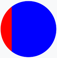
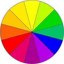
But I want it to look more like this?:

Coloured wheel

Is this possible in CSS or am I going to have to use a background image (I'd rather avoid this because it isn't as easy to scale as the page resizes etc..)?

Best Answer

One solution is to use multiple background layer considering rotated linear-gradient. We can also rely on pseudo-element and some transparent colors.

Then simply adjust the degrees, colors, opacity of colors and position of pseudo element to obtain any chart you want:

.circle {
  margin: 20px;
  width: 200px;
  height: 200px;
  border-radius: 50%;
  background: 
    linear-gradient(to right, rgba(255,0,0,0.5) 50%, yellow 0%), 
    linear-gradient(-110deg, black 50%, pink 0%);
  position: relative;
  overflow: hidden;
}

.circle:after,
.circle:before{
  content: "";
  position: absolute;
  top: 0;
  left: 0;
  bottom: 0;
  right: 0;
}
.circle:after {
  background: linear-gradient(-45deg, rgba(255, 180, 180, 0.5) 50%, transparent 0%);
    bottom: 50%;
    left: 50%;
}

.circle:before {
  background: 
    linear-gradient(0deg, rgba(128, 169, 170, 0.5) 50%, transparent 0%), 
    linear-gradient(50deg, rgba(0, 169, 170, 1) 50%, transparent 0%);
}
<div class="circle"></div>

Here is more example considering different configuration

  1. Using only one element and multiple gradient:

.circle {
  margin: 20px;
  width: 200px;
  height: 200px;
  border-radius: 50%;
  background: linear-gradient(0deg, rgba(0, 255, 217, 0.4) 50%, transparent 0%), 
              linear-gradient(45deg, rgba(0, 128, 0, 0.4) 50%, transparent 0%), 
              linear-gradient(90deg, rgba(11, 255, 0, 0.4) 50%, transparent 0%), 
              linear-gradient(135deg, pink 50%, transparent 0%), 
              linear-gradient(180deg, brown 50%, transparent 0%),
              linear-gradient(225deg, yellow 50%, transparent 0%),
              linear-gradient(270deg, red 50%, transparent 0%);
  position: relative;
  overflow: hidden;
}
<div class="circle"></div>

  1. Using multiple elements and one gradient per element :

.circle {
  margin: 20px;
  width: 200px;
  height: 200px;
  border-radius: 50%;
  background: linear-gradient(to right, red 50%, yellow 0%);
  position: relative;
  overflow: hidden;
}

.circle:after {
  content: "";
  position: absolute;
  top: 0;
  left: 0;
  bottom: 0;
  right: 0;
  background: linear-gradient(45deg, rgba(255, 180, 180, 0.5) 50%, transparent 0%);
}

.circle:before {
  content: "";
  position: absolute;
  top: 0;
  left: 0;
  bottom: 0;
  right: 0;
  background: linear-gradient(125deg, rgba(128, 169, 170, 0.5) 50%, transparent 0%);
}

.circle-alt {
  width: 200px;
  height: 200px;
  border-radius: 50%;
  background: linear-gradient(to bottom, rgba(0, 250, 0, 0.5) 50%, rgba(0, 250, 255, 0.5) 0%);
  position: absolute;
  overflow: hidden;
}
<div class="circle">
  <div class="circle-alt"></div>
</div>

  1. Using Multiple elements and multiple gradients per elements and only solid color (without changing background-position like the answer of @vals) :

.circle {
  margin: 20px;
  width: 200px;
  height: 200px;
  border-radius: 50%;
  background: linear-gradient(to right, red 50%, transparent 0%), 
              linear-gradient(225deg, transparent 50%, blue 0%),
              linear-gradient(0deg, green 50%, transparent 0%),
              linear-gradient(-45deg, black 50%, transparent 0%),
              linear-gradient(-90deg, yellow 50%, transparent 0%);
  position: relative;
  overflow: hidden;
}

.circle:before {
  content: "";
  position: absolute;
  top: 0;
  left: 0;
  bottom: 50%;
  right: 50%;
  background:linear-gradient(45deg,lightblue 50%, transparent 0%)
}
.circle:after {
  content: "";
  position: absolute;
  top: 50%;
  left: 0;
  bottom: 0;
  right: 50%;
  background:linear-gradient(135deg, brown 50%, pink 0%);
}
<div class="circle"></div>

  1. The wheel of fortune (With rotation !):

.circle {
  margin: 20px;
  width: 200px;
  height: 200px;
  border-radius: 50%;
  background: linear-gradient(to right, #06b51d 50%, transparent 0%), 
              linear-gradient(60deg, #7e00ff 50%, transparent 0%), 
              linear-gradient(30deg, #ff00bd 50%, transparent 0%), 
              linear-gradient(0deg, #ff0000 50%, transparent 0%), 
              linear-gradient(-30deg, #ff4700 50%, transparent 0%), 
              linear-gradient(-60deg, #ffa500 50%, transparent 0%), 
              linear-gradient(-90deg, #ffff00 50%, transparent 0%);
  position: relative;
  overflow: hidden;
  animation: rotate 6s linear infinite;
}
.circle:before {
  content: "";
  position: absolute;
  top: 0;
  left: 0;
  bottom: 50%;
  right: 50%;
  background: linear-gradient(210deg, transparent 64%, #09ffa5 0%),
              linear-gradient(240deg, transparent 37%, #34ff00 0%);
}

.circle:after {
  content: "";
  position: absolute;
  top: 50%;
  left: 0;
  bottom: 0;
  right: 50%;
  background:linear-gradient(150deg, #00acff 37%, transparent 0%),
             linear-gradient(120deg, #0075ff 63%, #1200ff 0%);
}
@keyframes rotate {
  from {
    transform: rotate(0deg);
  }
  to {
    transform: rotate(360deg);
  }
}
<div class="circle"></div>


Related question with a different way to achieve the same result: Sass/CSS color wheel