Problem
I have a <select> where one of its <option>’s text values is very long. I want the <select> to resize so it is never wider than its parent, even if it has to cut off its displayed text. max-width: 100% should do that.
Before resize:
What I want after resize:

But if you load this jsFiddle example and resize the Result panel’s width to be smaller than that of the <select>, you can see that the select inside the <fieldset> fails to scale its width down.
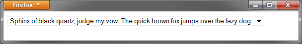
What I’m actually seeing after resize:

However, the equivalent page with a <div> instead of a <fieldset> does scale properly. You can see that and test your changes more easily if you have a <fieldset> and a <div> next to each other on one page. And if you delete the surrounding <fieldset> tags, the resizing works. The <fieldset> tag is somehow causing horizontal resizing to break.
The <fieldset> acts is as if there is a CSS rule fieldset { min-width: min-content; }. (min-content means, roughly, the smallest width that doesn’t cause a child to overflow.) If I replace the <fieldset> with a <div> with min-width: min-content, it looks exactly the same. Yet there is no rule with min-content in my styles, in the browser default stylesheet, or visible in Firebug’s CSS Inspector. I tried to override every style visible on the <fieldset> in Firebug’s CSS Inspector and in Firefox’s default stylesheet forms.css, but that didn’t help. Specifically overriding min-width and width didn’t do anything either.
Code
HTML of the fieldset:
<fieldset>
    <div class="wrapper">
        <select id="section" name="section">
            <option value="-1"></option>
            <option value="1501" selected="selected">Sphinx of black quartz, judge my vow. The quick brown fox jumps over the lazy dog.</option>
            <option value="1480">Subcontractor</option>
            <option value="3181">Valley</option>
            <option value="3180">Ventura</option>
            <option value="3220">Very Newest Section</option>
            <option value="1481">Visitor</option>
            <option value="3200">N/A</option>
        </select>
    </div>
</fieldset>
My CSS that should be working but isn’t:
fieldset {
    /* hide fieldset-specific visual features: */
    margin: 0;
    padding: 0;
    border: none;
}

select {
    max-width: 100%;
}
Resetting the width properties to the defaults does nothing:
fieldset {
    width: auto;
    min-width: 0;
    max-width: none;
}
Further CSS in which I try and fail to fix the problem:
/* try lots of things to fix the width, with no success: */
fieldset {
    display: block;
    min-width: 0;
    max-width: 100%;
    width: 100%;
    text-overflow: clip;
}

div.wrapper {
    width: 100%;
}

select {
    overflow: hidden;
}
More details
The problem also occurs in this more comprehensive, more complicated jsFiddle example, which is more similar to the web page I’m actually trying to fix. You can see from that that the <select> is not the problem – an inline-block div also fails to resize. Though this example is more complicated, I assume that the fix for the simple case above will also fix this more complicated case.
[Edit: see browser support details below.]
One curious thing about this problem is that if you set div.wrapper { width: 50%; }, the <fieldset> stops resizing itself at the point then the full-size <select> would have hit the edge of the viewport. The resizing happens as if the <select> has width: 100%, even though the <select> looks like it has width: 50%.

If you give the <select> itself width: 50%, that behavior does not occur; the width is simply correctly set.

I don’t understand the reason for that difference. But it may not be relevant.
I also found the very similar question HTML fieldset allows children to expand indefinitely. The asker couldn’t find a solution and guesses that there is no solution apart from removing the <fieldset>. But I’m wondering, if it really is impossible to make the <fieldset> display right, why is that? What in <fieldset>’s spec or default CSS (as of this question) causes this behavior? This special behavior is probably be documented somewhere, since multiple browsers work like this.
Background goal and requirements
The reason I’m trying to do this is as part of writing mobile styles for an existing page with a big form. The form has multiple sections, and one part of it is wrapped in a <fieldset>. On a smartphone (or if you make your browser window small), the part of the page with the <fieldset> is much wider than the rest of the form. Most of the form constrains its width just fine, but the section with the <fieldset> does not, forcing the user to zoom out or scroll right to see all of that section.
I’m wary of simply removing the <fieldset>, as it is generated on many pages in a big app, and I’m not sure what selectors in CSS or JavaScript might depend on it.
I can use JavaScript if I need to, and a JavaScript solution is better than nothing. But if JavaScript is the only way to do this, I’d be curious to hear an explanation for why this is not possible using only CSS and HTML.
Edit: browser support
On the site, I need to support Internet Explorer 8 and later (we just dropped support for IE7), the latest Firefox, and the latest Chrome. This particular page should also work on iOS and Android smartphones. Slightly degraded but still usable behavior is acceptable for Internet Explorer 8.
I retested my broken fieldset example on different browsers. It actually already works in these browsers:
- Internet Explorer 8, 9, and 10
- Chrome
- Chrome for Android
It breaks in these browsers:
- Firefox
- Firefox for Android
- Internet Explorer 7
Thus, the only browser I care about that the current code breaks in is Firefox (on both desktop and mobile). If the code were fixed so it worked in Firefox without breaking it in any other browsers, that would solve my problem.
The site HTML template uses Internet Explorer conditional comments to add classes such .ie8 and .oldie to the <html> element. You can use those classes in your CSS if you need to work around styling differences in IE. The classes added are the same as in this old version of HTML5 Boilerplate.
Best Answer
Update (25 Sept 2017)
The Firefox bug described below is fixed as of Firefox 53 and the link to this answer has finally been removed from Bootstrap's documentation.
Also, my sincere apologies to the Mozilla contributors who had to block removing support for
-moz-documentpartly due to this answer.The fix
In WebKit and Firefox 53+, you just set
min-width: 0;on the fieldset to override the default value ofmin-content.¹Still, Firefox is a bit… odd when it comes to fieldsets. To make this work in earlier versions, you must change the
displayproperty of the fieldset to one of the following values:table-cell(recommended)table-columntable-column-grouptable-footer-grouptable-header-grouptable-rowtable-row-groupOf these, I recommend
table-cell. Bothtable-rowandtable-row-groupprevent you from changing width, whiletable-columnandtable-column-groupprevent you from changing height.This will (somewhat reasonably) break rendering in IE. Since only Gecko needs this, you can justifiably use
@-moz-document—one of Mozilla's proprietary CSS extensions—to hide it from other browsers:(Here's a jsFiddle demo.)
That fixes things, but if you're anything like me your reaction was something like…
What.
There is a reason, but it's not pretty.
The default presentation of the fieldset element is absurd and essentially impossible to specify in CSS. Think about it: the fieldset's border disappears where it's overlapped by a legend element, but the background remains visible! There's no way to reproduce this with any other combination of elements.
To top it off, implementations are full of concessions to legacy behaviour. One such is that the minimum width of a fieldset is never less than the intrinsic width of its content. WebKit gives you a way to override this behaviour by specifying it in the default stylesheet, but Gecko² goes a step further and enforces it in the rendering engine.
However, internal table elements constitute a special frame type in Gecko. Dimensional constraints for elements with these
displayvalues set are calculated in a separate code path, entirely circumventing the enforced minimum width imposed on fieldsets.Again—the bug for this has been fixed as of Firefox 53, so you do not need this hack if you are only targeting newer versions.
Is using
@-moz-documentsafe?For this one issue, yes.
@-moz-documentworks as intended in all versions of Firefox up until 53, where this bug is fixed.This is no accident. Due in part to this answer, the bug to limit
@-moz-documentto user/UA stylesheets was made dependent on the underlying fieldset bug being fixed first.Beyond this, do not use
@-moz-documentto target Firefox in your CSS, other resources notwithstanding.³¹ Value may be prefixed. According to one reader, this has no effect in Android 4.1.2 Stock Browser and possibly other old versions; I have not had time to verify this.
² All links to the Gecko source in this answer refer to the 5065fdc12408 changeset, committed 29ᵗʰ July 2013; you may wish to compare notes with the most recent revision from Mozilla Central.
³ See e.g. SO #953491: Targeting only Firefox with CSS and CSS Tricks: CSS hacks targeting Firefox for widely referenced articles on high-profile sites.