I'm trying to over ride the default error message label with a div instead of a label. I have looked at this post as well and get how to do it but my limitations with CSS are haunting me. How can I display this like some of these examples:
Example #1 (Dojo) – Must type invalid input to see error display
Example #2
Here is some example code that overrides the error label to a div element
$(document).ready(function(){
            $("#myForm").validate({
                rules: {
                    "elem.1": {
                        required: true,
                        digits: true
                    },
                    "elem.2": {
                        required: true
                    }
                },
                errorElement: "div"
            });
        });
Now I'm at a loss on the css part but here it is:
div.error {
        position:absolute;
        margin-top:-21px;
     margin-left:150px;
     border:2px solid #C0C097;
        background-color:#fff;
        color:white;
        padding:3px;
        text-align:left;
        z-index:1;
        color:#333333;
     font:100% arial,helvetica,clean,sans-serif;
     font-size:15px;
     font-weight:bold;
    }
UPDATE:
Okay I'm using this code now but the image and the placement on the popup is larger than the border, can this be adjusted to be dynamic is height?
if (element.attr('type') == 'radio' || element.attr('type') == 'checkbox') {
   element = element.parent();

   offset = element.offset();
   error.insertBefore(element)
   error.addClass('message');  // add a class to the wrapper
   error.css('position', 'absolute');
   error.css('left', offset.left + element.outerWidth());
   error.css('top', offset.top - (element.height() / 2)); // Not working for Radio, displays towards the bottom of the element. also need to test with checkbox
} else {
   // Error placement for single elements
   offset = element.offset();
   error.insertBefore(element)
   error.addClass('message');  // add a class to the wrapper
   error.css('position', 'absolute');
   error.css('left', offset.left + element.outerWidth());
   error.css('top', offset.top - (element.height() / 2));
}
the css is the same as below (your css code)
Html
<span>
<input type="radio" class="checkbox" value="P" id="radio_P" name="radio_group_name"/>
<label for="radio_P">P</label>
<input type="radio" class="checkbox" value="S" id="radio_S" name="radio_group_name"/>
<label for="radio_S">S</label>
</span>
Best Answer
You can use the errorPlacement option to override the error message display with little css. Because css on its own will not be enough to produce the effect you need.
You can play with the left and top css attributes to show the error message on top, left, right or bottom of the element. For example to show the error on the top:
And so on. You can refer to jQuery documentation about css for more options.
Here is the css I used. The result looks exactly like the one you want. With as little CSS as possible:
And here is the background image you need:
(source: scriptiny.com)
If you want the error message to be displayed after a group of options or fields. Then group all those elements inside one container a 'div' or a 'fieldset'. Add a special class to all of them 'group' for example. And add the following to the begining of the errorPlacement function:
If you only want to handle specific cases you can use attr instead:
That should be enough for the error message to be displayed next to the parent element.
You may need to change the width of the parent element to be less than 100%.
I've tried your code and it is working perfectly fine for me. Here is a preview: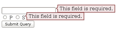
I just made a very small adjustment to the message padding to make it fit in the line:
You can change those numbers to increase/decrease the padding on top/bottom or left/right. You can also add a height and width to the error message. If you are still having issues, try to replace the span with a div
And then give the container a width (this is very important)
About the blank page. As I said I tried your code and it is working for me. It might be something else in your code that is causing the issue.