I'm currently learning how to build apps using the Flutter SDK and Android Studio. My problem is that I need to add a Divider widget between the 'Administrative' text and the rest of the Card but as you can see in the screenshot below, the divider isn't showing up. I've tried changing the size (In which case the space between the two texts just increases) and I've tried setting the color to see if it was defaulting to transparent on my phone. Nothing works!
Here's my code for the Card Widget State:
class BBSCardState extends State<BBSCard>{
  @override
  Widget build(BuildContext context) {
    return new Padding(
      padding: const EdgeInsets.only(top: 16.0, bottom: 16.0, left: 12.0, right: 12.0),
      child: new Card(
        child: new Row(
          children: <Widget>[
            new Column(
              mainAxisSize: MainAxisSize.min,
              children: <Widget>[
                new Padding(
                  padding: const EdgeInsets.only(top: 22.0, bottom: 8.0),
                  child: new Text("Administrative", style: new TextStyle(color: new Color.fromARGB(255, 117, 117, 117), fontSize: 32.0, fontWeight: FontWeight.bold)),
                ),
                new Divider(),
                new Text("text")
              ],
            ),
          ],
          mainAxisSize: MainAxisSize.max,
          mainAxisAlignment: MainAxisAlignment.center,
        )
      )
    );
  }
}
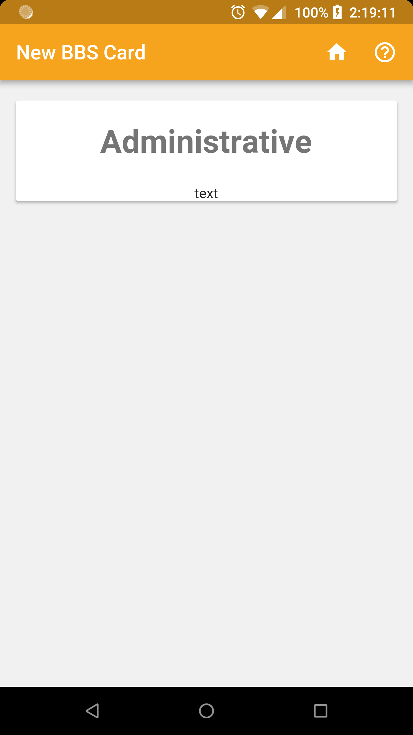
And here's the screenshot of what the card looks like:
Also:
Is there any way to increase the size of the actual line from the Divider? (Not just the spacing)
Thanks!
Best Answer
You could remove
Row, thenColumnwould take all available space andDividerwould have width.To make custom divider you could check implementation of
Dividerand adjust it. E.g. replaceDividerwith