R – How to disable XP themes in WPF application

tabcontrolthemeswindows-xpwpf

I have a WPF application (.NET 3.0, VS2008) that displays data in a tab control. Custom colors are required on virtually all controls in this application : basically white foreground and green background.

My problem is that when an XP theme (say Luna) is active, it is automatically applied to render controls so that my white text is written on … a white background. For instance on the active tab item header :
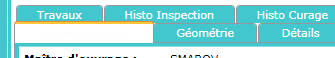
 Unreadable tab item header

I have tried :

  • to remove the embedded manifest file from the generated application (in the project properties) : useless.
  • to force the use of the Windows Classic theme in the application resources :

    <ResourceDictionary.MergedDictionaries>
      <ResourceDictionary Source="/PresentationFramework.Classic;V3.0.0.0;31bf3856ad364e35;component/themes/classic.xaml" />
    </ResourceDictionary.MergedDictionaries>
    

This last attempt worked great for all controls, except the tab control which still displays as above.

Any idea ?

Update : I am suspecting this behaviour is due to the custom style I have to apply to the tab control :

<Window.Resources>
  <Style x:Key="Custom">
    <Setter Property="Control.Background" Value="#FF47C7C8" />
    <Setter Property="Control.Foreground" Value="White" />
  </Style>
  <Style TargetType="TabControl" BasedOn="{StaticResource Custom}" />
</Window.Resources>

So how can I get the classic theme with custom colors ?

Best Answer

Your best bet, to ensure a consistent behavior and appearance across operating systems, would be to re-template the TabItem control and then use a Trigger to modify a part of your new template when a TabItem is selected. Try something like the following:

<Grid>
<Grid.Resources>
  <Style x:Key="Custom">
    <Setter Property="Control.Background" Value="#FF47C7C8"/>
    <Setter Property="Control.BorderBrush" Value="#FF47C7C8"/>
    <Setter Property="Control.Foreground" Value="White"/>
  </Style>
  <Style BasedOn="{StaticResource Custom}" TargetType="TabControl"/>
  <Style TargetType="TabItem">
    <Setter Property="Foreground" Value="White"/>
    <Setter Property="Template">
      <Setter.Value>
        <ControlTemplate TargetType="{x:Type TabItem}">
          <Grid>
            <Border
              Name="Border"
              Background="#FF47C7C8"
              BorderBrush="#FFFFFF"
              BorderThickness="1,1,1,1"
              CornerRadius="2,2,0,0">
              <ContentPresenter
                x:Name="ContentSite"
                HorizontalAlignment="Center"
                Margin="12,2,12,2"
                VerticalAlignment="Center"
                ContentSource="Header"
                RecognizesAccessKey="True"/>
            </Border>
          </Grid>
          <ControlTemplate.Triggers>
            <Trigger Property="IsSelected" Value="True">
              <Setter Property="Panel.ZIndex" Value="100"/>
              <Setter TargetName="Border" Property="Background" Value="#FF47C7C8"/>
              <Setter TargetName="Border" Property="BorderThickness" Value="1,1,1,0"/>
            </Trigger>
          </ControlTemplate.Triggers>
        </ControlTemplate>
      </Setter.Value>
    </Setter>
  </Style>
</Grid.Resources>
<TabControl>
  <TabItem Header="Item 1"/>
  <TabItem Header="Item 2"/>
  <TabItem Header="Item 3"/>
  <TabItem Header="Item 4"/>
</TabControl>

Bon chance!

Related Topic