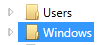
The selected item in a WPF TreeView has a dark blue background with "sharp" corners. That looks a bit dated today:
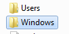
I would like to change the background to look like in Explorer of Windows 7 (with/without focus):

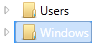
What I tried so far does not remove the original dark blue background but paints a rounded border on top of it so that you see the dark blue color at the edges and at the left side – ugly.
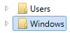
Interestingly, when my version does not have the focus, it looks pretty OK:
I would like to refrain from redefining the control template as shown here or here. I want to set the minimum required properties to make the selected item look like in Explorer.
Alternative: I would also be happy to have the focused selected item look like mine does now when it does not have the focus. When losing the focus, the color should change from blue to grey.
Here is my code:
<TreeView
    x:Name="TreeView"
    ItemsSource="{Binding TopLevelNodes}"
    VirtualizingStackPanel.IsVirtualizing="True"
    VirtualizingStackPanel.VirtualizationMode="Recycling">

    <TreeView.ItemContainerStyle>
        <Style TargetType="{x:Type TreeViewItem}">
            <Setter Property="IsExpanded" Value="{Binding IsExpanded, Mode=TwoWay}" />
            <Setter Property="IsSelected" Value="{Binding IsSelected, Mode=TwoWay}" />

            <Style.Triggers>
                <Trigger Property="IsSelected" Value="True">
                    <Setter Property="BorderBrush" Value="#FF7DA2CE" />
                    <Setter Property="Background" Value="#FFCCE2FC" />
                </Trigger>
            </Style.Triggers>
        </Style>
    </TreeView.ItemContainerStyle>

    <TreeView.Resources>
        <HierarchicalDataTemplate DataType="{x:Type viewmodels:ObjectBaseViewModel}" ItemsSource="{Binding Children}">
            <Border Name="ItemBorder" CornerRadius="2" Background="{Binding Background, RelativeSource={RelativeSource AncestorType=TreeViewItem}}"
                      BorderBrush="{Binding BorderBrush, RelativeSource={RelativeSource AncestorType=TreeViewItem}}" BorderThickness="1">
                <StackPanel Orientation="Horizontal" Margin="2">
                    <Image Name="icon" Source="/ExplorerTreeView/Images/folder.png"/>
                    <TextBlock Text="{Binding Name}"/>
                </StackPanel>
            </Border>
        </HierarchicalDataTemplate>
    </TreeView.Resources>
</TreeView>
Solution
With the excellent answers of Sheridan and Meleak my TreeView now looks like this in code (a result I am very happy with and which is pretty near Explorer's style):
<TreeView
...
    <TreeView.ItemContainerStyle>
        <Style TargetType="{x:Type TreeViewItem}">
            <!-- Style for the selected item -->
            <Setter Property="BorderThickness" Value="1"/>
            <Style.Triggers>
                <!-- Selected and has focus -->
                <Trigger Property="IsSelected" Value="True">
                    <Setter Property="BorderBrush" Value="#7DA2CE"/>
                </Trigger>
                <!-- Mouse over -->
                <Trigger Property="helpers:TreeView_IsMouseDirectlyOverItem.IsMouseDirectlyOverItem" Value="True">
                    <Setter Property="Background">
                        <Setter.Value>
                            <LinearGradientBrush EndPoint="0,1" StartPoint="0,0">
                                <GradientStop Color="#FFFAFBFD" Offset="0"/>
                                <GradientStop Color="#FFEBF3FD" Offset="1"/>
                            </LinearGradientBrush>
                        </Setter.Value>
                    </Setter>
                    <Setter Property="BorderBrush" Value="#B8D6FB"/>
                </Trigger>
                <!-- Selected but does not have the focus -->
                <MultiTrigger>
                    <MultiTrigger.Conditions>
                        <Condition Property="IsSelected" Value="True"/>
                        <Condition Property="IsSelectionActive" Value="False"/>
                    </MultiTrigger.Conditions>
                    <Setter Property="BorderBrush" Value="#D9D9D9"/>
                </MultiTrigger>
            </Style.Triggers>
            <Style.Resources>
                <Style TargetType="Border">
                    <Setter Property="CornerRadius" Value="2"/>
                </Style>
            </Style.Resources>
        </Style>
    </TreeView.ItemContainerStyle>

    <TreeView.Resources>
        <HierarchicalDataTemplate DataType="{x:Type viewmodels:ObjectBaseViewModel}" ItemsSource="{Binding Children}">
            <StackPanel Orientation="Horizontal" Margin="2,1,5,2">
                <Grid Margin="0,0,3,0">
                    <Image Name="icon" Source="/ExplorerTreeView/Images/folder.png"/>
                </Grid>
                <TextBlock Text="{Binding Name}" />
            </StackPanel>
        </HierarchicalDataTemplate>

        <!-- Brushes for the selected item -->
        <LinearGradientBrush x:Key="{x:Static SystemColors.HighlightBrushKey}" EndPoint="0,1" StartPoint="0,0">
            <GradientStop Color="#FFDCEBFC" Offset="0"/>
            <GradientStop Color="#FFC1DBFC" Offset="1"/>
        </LinearGradientBrush>
        <LinearGradientBrush x:Key="{x:Static SystemColors.ControlBrushKey}" EndPoint="0,1" StartPoint="0,0">
            <GradientStop Color="#FFF8F8F8" Offset="0"/>
            <GradientStop Color="#FFE5E5E5" Offset="1"/>
        </LinearGradientBrush>
        <SolidColorBrush x:Key="{x:Static SystemColors.HighlightTextBrushKey}" Color="Black" />
        <SolidColorBrush x:Key="{x:Static SystemColors.ControlTextBrushKey}" Color="Black" />
    </TreeView.Resources>
</TreeView>
Best Answer
Adding to @Sheridan's answer
This isn't a 100% accurate but should get you pretty close (it's using the colors from
GridViewwhich is pretty close to Windows Explorer)